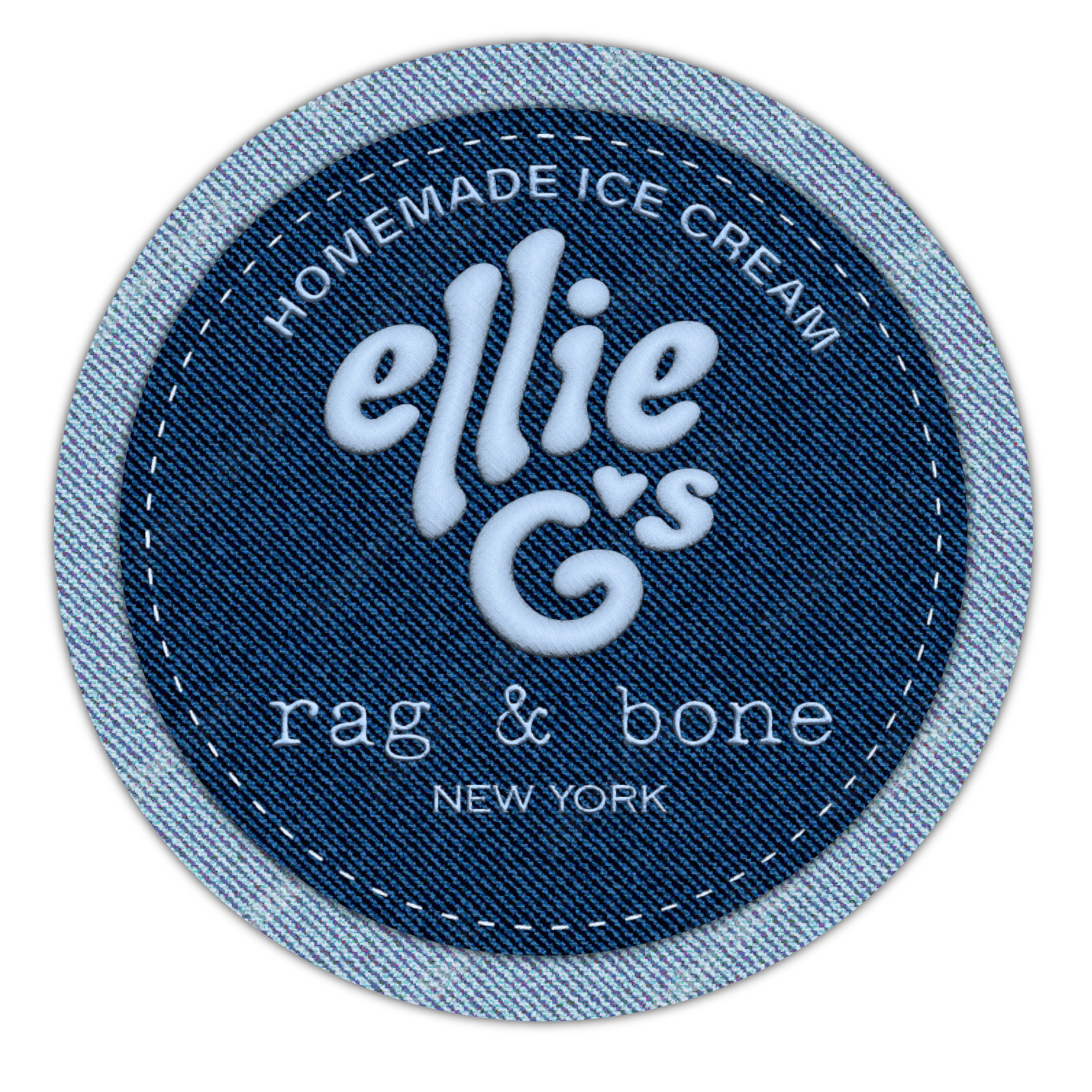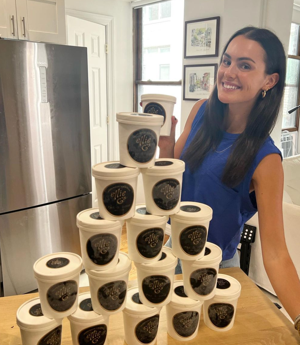

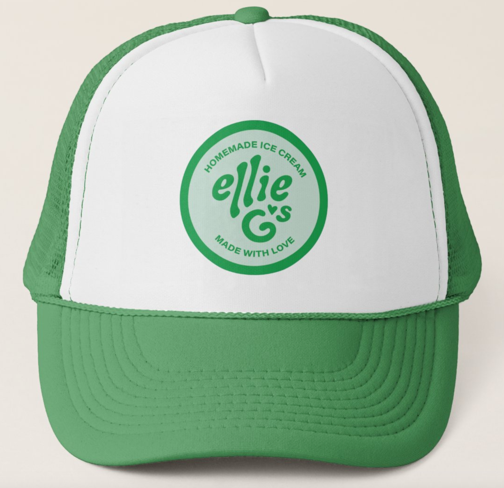
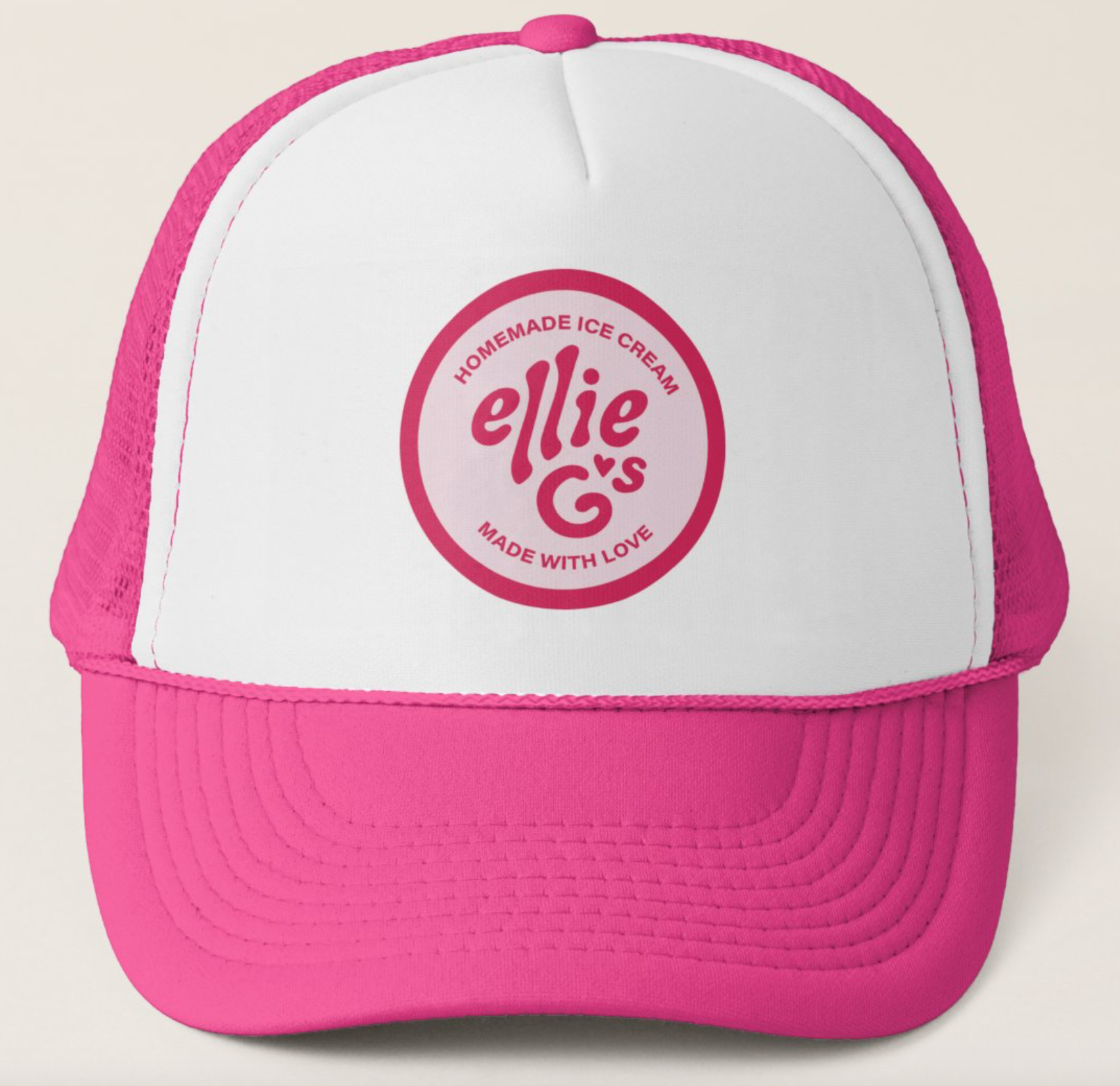
Challenge: Create the brand identity for Ellie G’s - an independently run, organic, community based ice cream business in New York, selling over 40 pints a week.
Idea: Represent the two most important principles of the company, “homemade” and “community”.
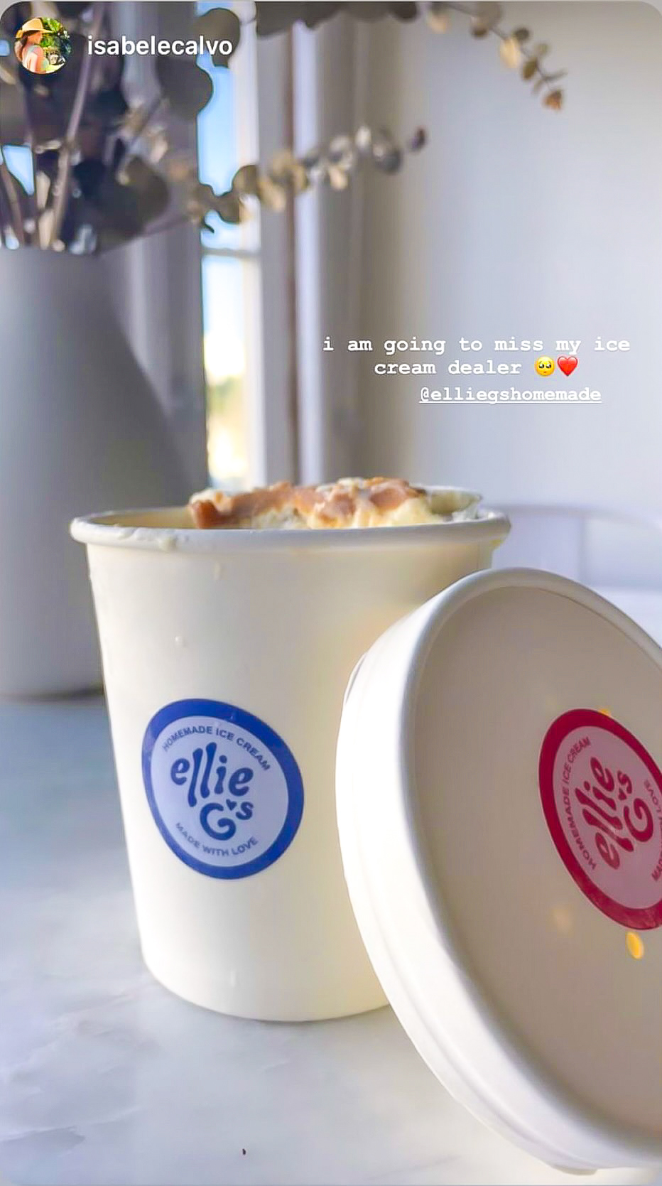
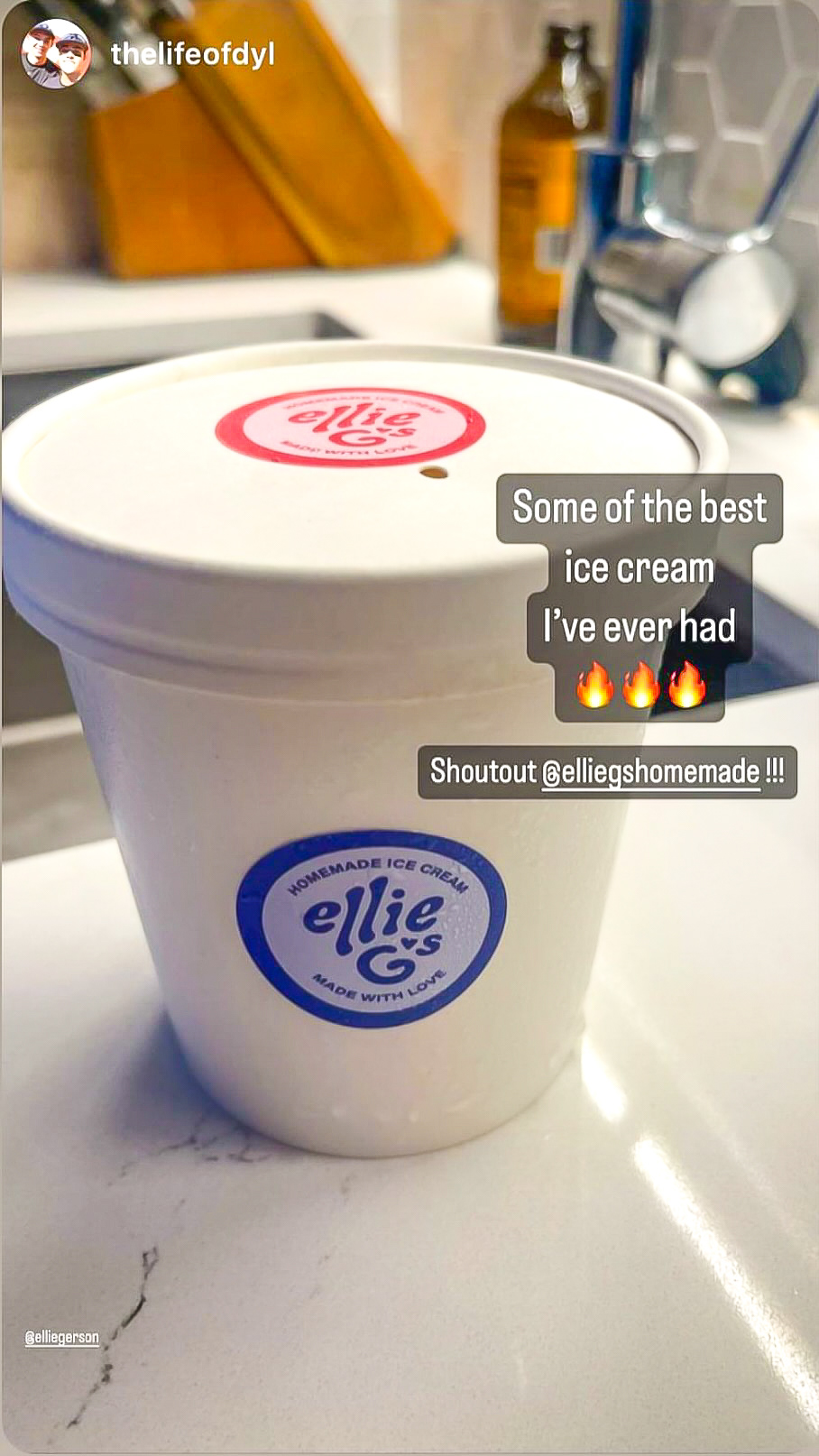
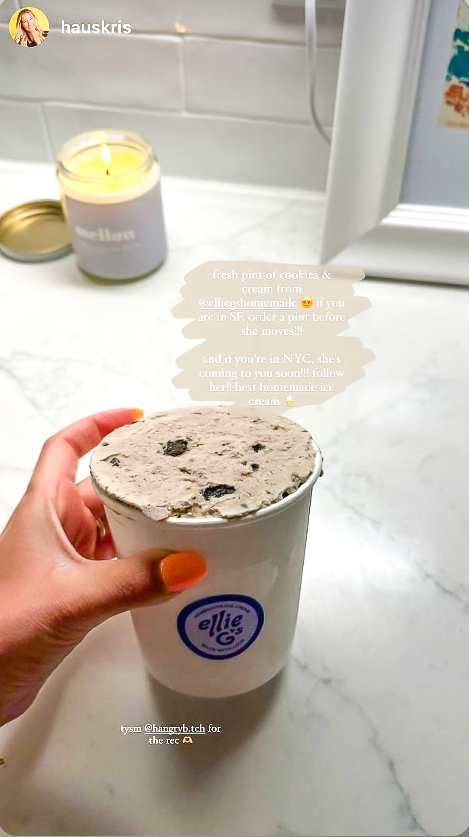

Solution: A hand drawn typeface to emphasize feeling of homemade. Use a heart as a symbol of community as well as visually express the sentiment of “made with love”.

Most recently, I designed multiple collaborations with Rag & Bone New York.